RE ONA
Role
UX/UI Designer
Timeline
12 Weeks
Tools
Figma, Otter.ai, Hotjar
View the website at www.reona.ca
Overview
RE ONA is a contemporary, non-seasonal ready-to-wear womenswear brand, designed in Toronto. As the e-commerce brand grew in popularity, their website was redesigned to improve their online user shopping experience.
For the website redesign, I focused on the display of information and improving crucial user flows, including the item browsing and checking out. All necessary changes beneficial to the business’s overall potential revenue.
Part 1: Research
Problem
The existing website did not provide a seamless e-commerce experience and RE ONA wanted to grow their revenue. Through my own shopping experience, I realized that basic tasks weren’t achievable and took longer to complete due to missing information.
Since RE ONA is primarily e-commerce, their overall sales depends solely on their website. To support the company’s goal of growth, the website needed UX redesign.
Solution
The solution was to redesign the website to streamline the shopping experience to increase overall conversion rate. If a website is easy to shop from, it reduces the amount of barriers that may keep users from checking out their cart.
A better website experience meant more sales aiding the company’s growth. The goal was to convert new customers into returning customers, and to keep existing customers coming back.
What does this mean?
Online shopping needs to be accessible, easy and convenient. Reducing the amount of potential barriers and streamlining the overall user experience leads to a higher successful checkout rate; leading to higher sales.
In order to gain more context on the issue, I conducted a heat map analysis of the website, analyzed competitor websites as well as user interviews.
Background research begun with my own initial walkthrough of the website, identifying any potential blockers as I was shopping.
Using Hotjar, I was able to see a visual representation of where and how frequently users were interacting with components on the site.
Post Hotjar analysis, it was made evident that the majority of users visiting RE ONA were first-time users. The short average session length meant that in order to encourage the new users to convert into recurring users, the website had to be as easy to navigate as possible; even for a first-time viewer.
Competitor Analysis
Djerf Avenue
Personalized sizing representation
Sense of community within brand
Orseund Iris
Detailed sizing charts
Editorial + product imagery
Khaite
Editorial imagery
Storytelling aspect on landing page
Main Issues Found
Lack of visual brand context on main pages for new users.
Missing crucial components needed for e-commerce site, hindering overall shopping experience.
Confusing product sizing information is deterring users from completing their transaction.
Identifying the User
Behaviours
Sustainability + ethics focused
Believes in mindful shopping
Values quality over quantity
Strong brand loyalty
Needs
Seamless shopping experience
Convenience
Frustrations
Lack of transparency
Unknown costs
Confusing size charts
Difficult to navigate on mobile/web
Part 2: Making Changes
Revision #1: Increasing Visual Brand Context
The original home page of the website was extremely short, offering little to no context on the brand. For first time users, there was little imagery or information to entice them to stay and browse.
Feedback from users proved that lengthening the home page using strong visual imagery and grouped collections for shopping ease had encouraged recurring website visits and lengthier visit times.
The visual layout of the home page may be rearranged at any time, with refreshes encouraged to keep users interested and excited for the website.
Revision #2: No Fuss Shopping Cart
The original shopping cart had been a minor but commonly reported annoyance by users. When adding to cart, users were unable to view the amount of items as well as which items were in their cart without exiting to a separate page. Users reported that this hindered their shopping flow and made it difficult to compare items while on the product page.
With the revised shopping cart, a numerical indicator on the cart helps users keep track of their items and the cart may be opened as a side modal on any page at any time.
Revision #3: Filtered Shopping
The original product collection page required users to manually scroll through each page of the website, without listing sizes or colour options on preview.
To make the shopping experience more convenient for users, a sort filter and size previews had been added, making it easier for customers to browse all items at a glance, and view their status without having to enter each individual product page.
Revision #4: Simple Sizing Charts
As RE ONA is primarily e-commerce, their customers are unable to try on clothing prior to ordering. Findings from user testing showed that users are more hesitant to complete a transaction after adding to cart if there is confusion around product sizing.
To encourage complete transactions from users, the size chart had been revised to provide customized measurements per product, per size along with a diagram. Users had responded positively to the transparency around sizing, leading to decrease in returns due to sizing issues.
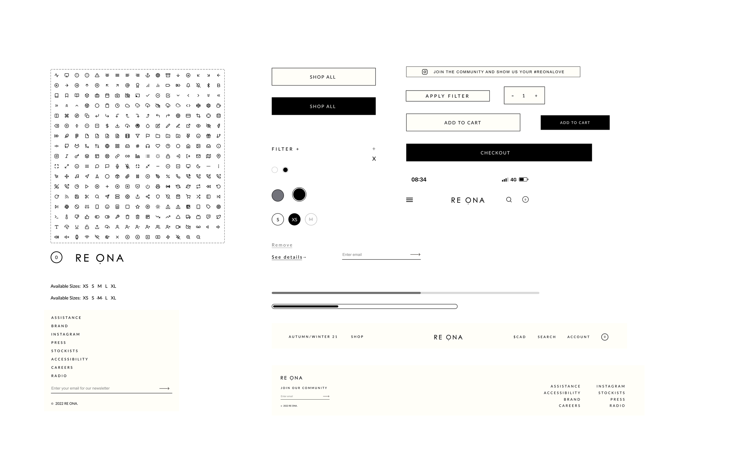
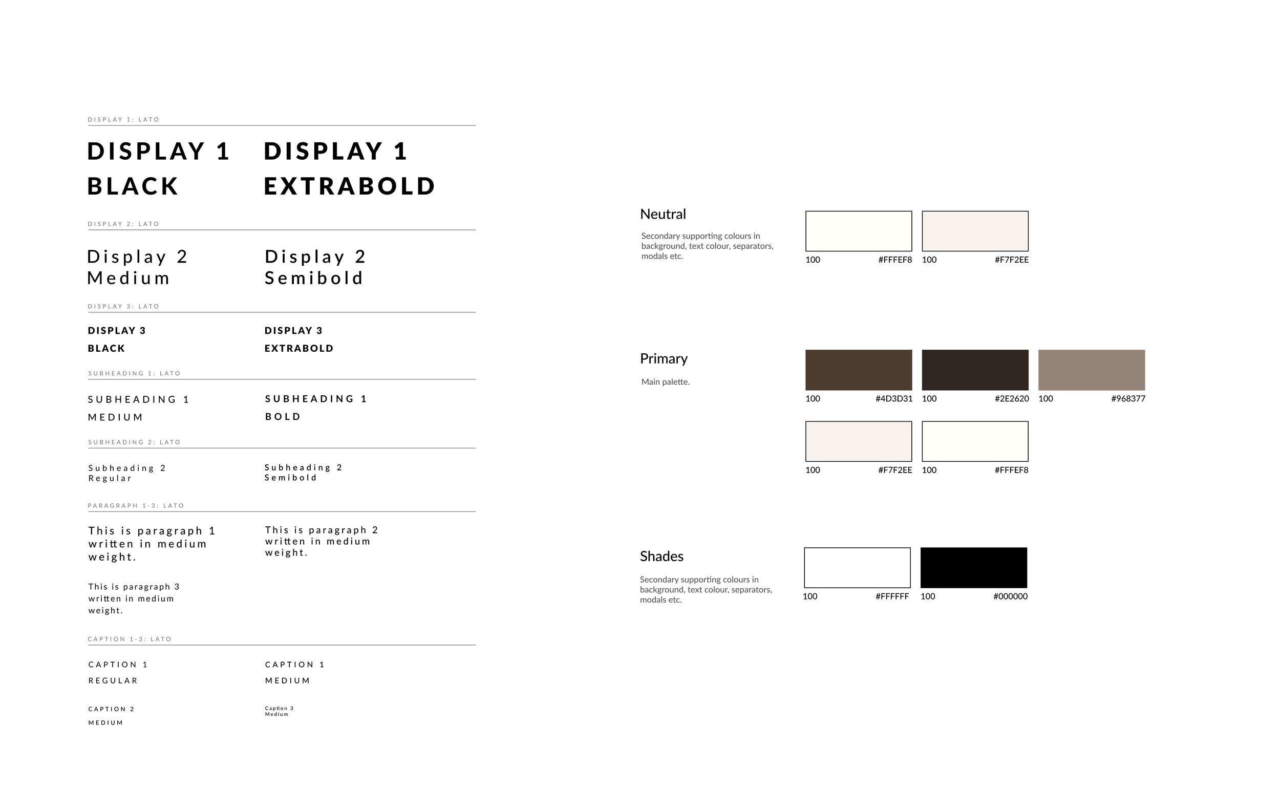
Design System


Next Steps
Limitation: Due to the time limit before SS22 release, certain aspects of the website revision had to be prioritized. Given more time, I’d love to explore:
Further user testing.
Prioritize personalization.
Build more extensive design system.
Learnings
Champion the user but don’t forget about the business’s needs too!
Designing for the user is always important as they need to be able to interact with your product however, when designing from a business standpoint, it is important to also consider potential design choices that can be made to support or increase potential profit.


