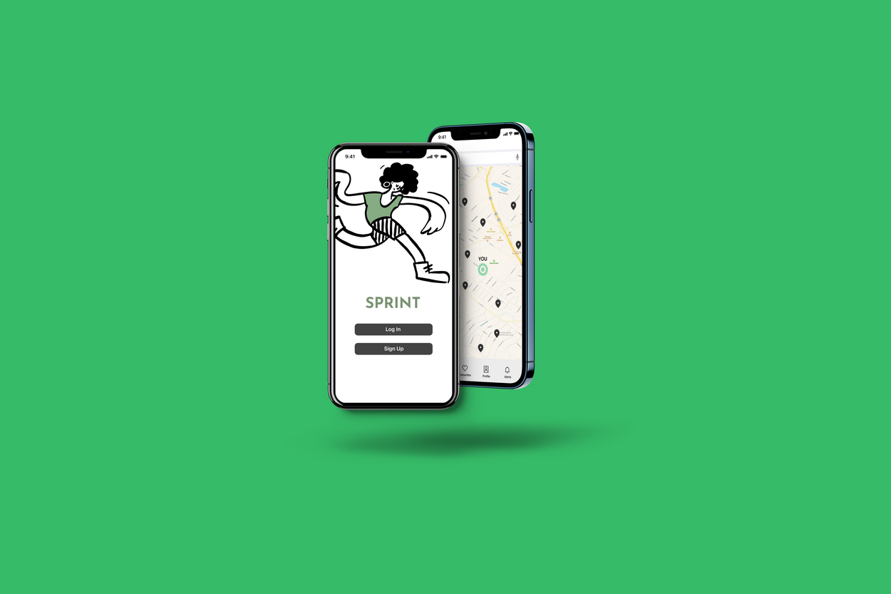
Sprint
Role
UX/UI Designer
Timeline
12 Weeks
Tools
Figma, Invision, Icons8
View the prototype here: https://www.figma.com/proto/nkUx5lxxT9IER99DhI7oMB/
Overview
Sprint is a transit app re-imagined to improve a user’s overall experience. Sprint targets real world problems and provides an effective, direct link of communication between users and resolution providers to address issues immediately.
Sprint was my first academic project as I was pivoting to UX/UI, and my introduction to proper design process, prioritizing the user from start to finish as well as research methods and techniques.
Part 1: Research
Problem
“Transit feels burdensome but I have no other choice.”
Transit applications are not a novel idea - they’ve been around for ages but none have satisfied my own personal need for safety and comfort.
As someone who had to work late nights, I never felt quite safe or fully relaxed on my way home. My environment simply wasn’t in the state in which I needed in order to feel safe.
Solution
Providing a platform compatible with the city transit system where users are able to report concerns with immediate assistance.
Streamlining communication so that users can feel supported - encouraging use of public transit and improving the overall experience.
What does this mean?
Factors outside the digital realm require inventive problem solving; an indirect approach. Bridging the gap between users and providers and streamlining communication improves efficiency, experience and usage.
Design Process
Understanding the Problem
To better grasp public transit and its existing issues as a whole, I conducted secondary research to inform my user interviews.
Three user interviews were conducted with experienced commuters; all with public transit as their main/only form of travel. The findings reiterated common pain points found from secondary research and allowed me to pinpoint user priorities.
Primary Research
Lack of support/unaware of support
Dirty surroundings
Digitally-focused
Lack of safety
Unreliability + wasted time
Secondary Research
Annoyance from delays and unreliability
Uncomfortable surroundings
Lack of real-time updates
Key Themes
Post affinity mapping, these key themes were established as most important to the user and prioritized while building out Sprint’s features.
1. Time & Cost
2. Sense of Security
3. Cleanliness
Identifying the User
Behaviours
Timid
Hardworking
Clean + tidy
Easily influenced by surroundings
Needs
Guaranteed feeling of safety
Comfortable environment
Reliability
Frustrations
Inconsistent updates
Unhygienic environment
Unaddressed complaints by personel
Lack of security
User Task Flow: Reporting a Cleanliness Problem
Mapping out the key feature of Sprint, this task flow visually depicts how users would go through reporting a problem on the app. Once finished, these reports would then be immediately addressed by appropriate personel.
Part 2: Style Guide
1. Colour Palette
Shades of green were chosen as the main colours for the app due to its known colour associations with transit. I kept visual clutter to a minimum relying on accent colours and typography to create contrast.
Each colour had been tested to ensure contrast was stark enough to be accessible and readable to all; making sure to avoid any known colourblind colour combinations.
2. Font
The typography is set in various weights from SF Pro Display, one of Apple’s system fonts.
The familiar font makes it easier for users to accustom themselves with the app; making the user experience feel more intuitive overall.
3. Considering Accessibility
Text is no smaller than 14px and all input fields are Siri-compatible for users that may struggle with tactile functions.
The voice to text option also allows users to be more aware of their surroundings as it frees them from typing.
Every page is labeled and the clean, minimal interface eliminates confusion.
Part 3: Design
Visual Interface
Initial sketches show the UI was rigid and block-like; during testing, it was confirmed that users did not find the visuals inviting and didn’t see the point of Sprint.
Rounded shapes and playful illustrations were then integrated for a softer visual impression. The changes were then brought to testing and received by users. 3/3 users stated that they would feel more inclined to use Sprint with the revised UI.
Notable Features
Feature #1: Filing Reports
Users are able to report cleanliness or safety issues directly on the app. A detailed input field allows users to provide key information necessary to resolve the issue. The direct communication via Sprint allows personel to resolve the issues presented with accuracy.
Feature #2: Minimizing Error
Users are not able to submit reports without completing all required input fields. An error message will notify the user should their report be incomplete. Inappropriate and spam images are limited and checked by the system moderator before uploading. Inappropriate images will be flagged and users are given warnings before a potential temporary ban. This ensures the app work efficiently to target and resolve transit related issues.
Learnings
Needs First, Then Aesthetics
I was really used to designing purely for visuals and found myself fixating on the appearance of the app more than the functionality.
Putting functionality as a first forced me to be more cognizant of my design choices and how they might affect users. I learned to prioritize research to support and inform the visual elements in my work.
More Testing
With more time, I would love to do more testing. The time constraint meant limited tests and redesigns - with more actual user feedback, Sprint could meet the needs of users better.
There are also other factors I have yet to consider including wifi connectivity, how it adapts to live issues and I would love to track the actual usage of the report function.


